

13 Sep Color in Senior Living Design and the Benefits
The benefits of using color in senior living design are great. When we design models for senior living communities, our goal is always to bring a feeling of comfort into the space. Above all, we aim to create a sense of home for your prospective residents and their families/ care givers. Did you know that color has a significant impact on our moods? That’s why incorporating color theory is an important element in our designs.
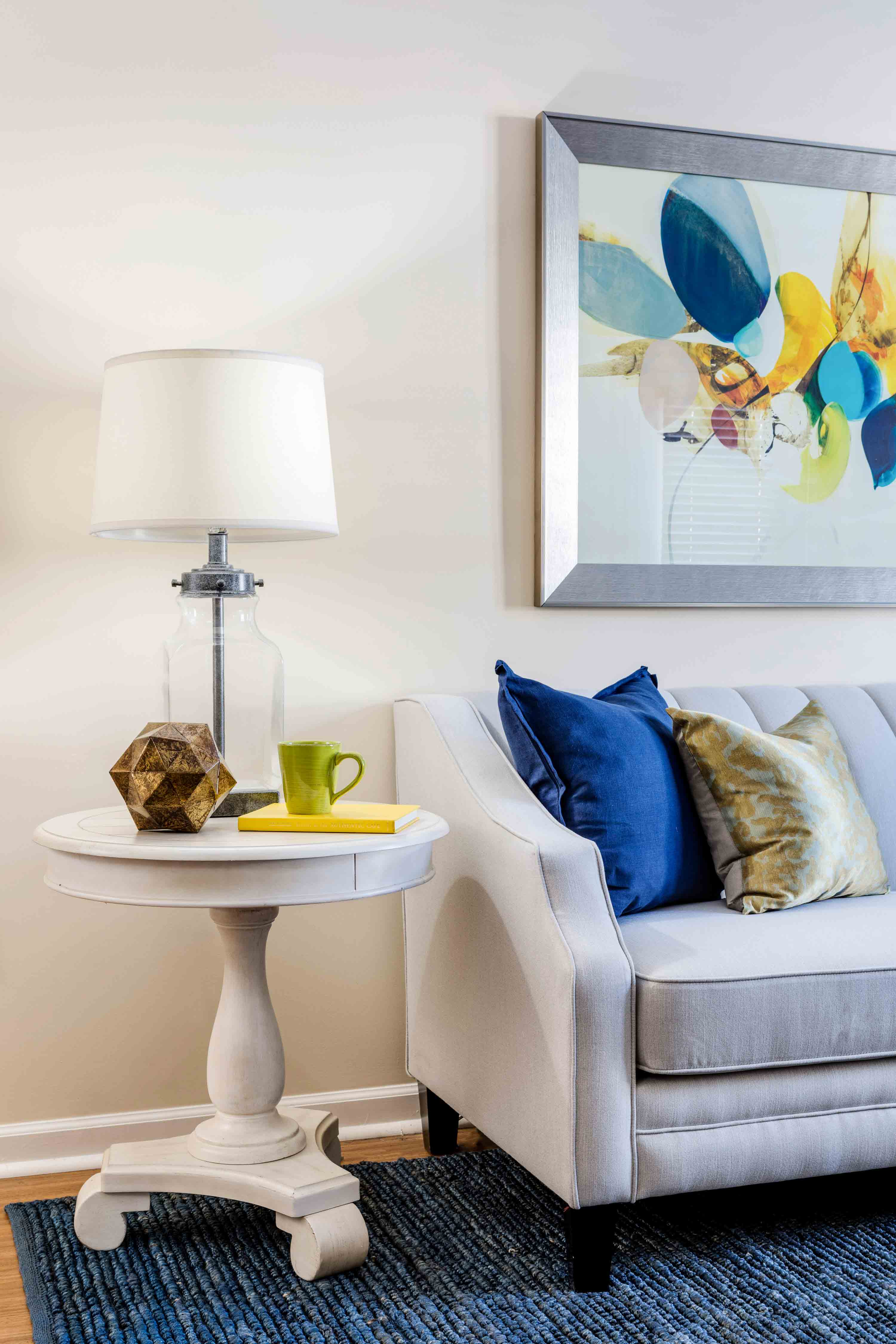
*Click on the image to see this project in our portfolio
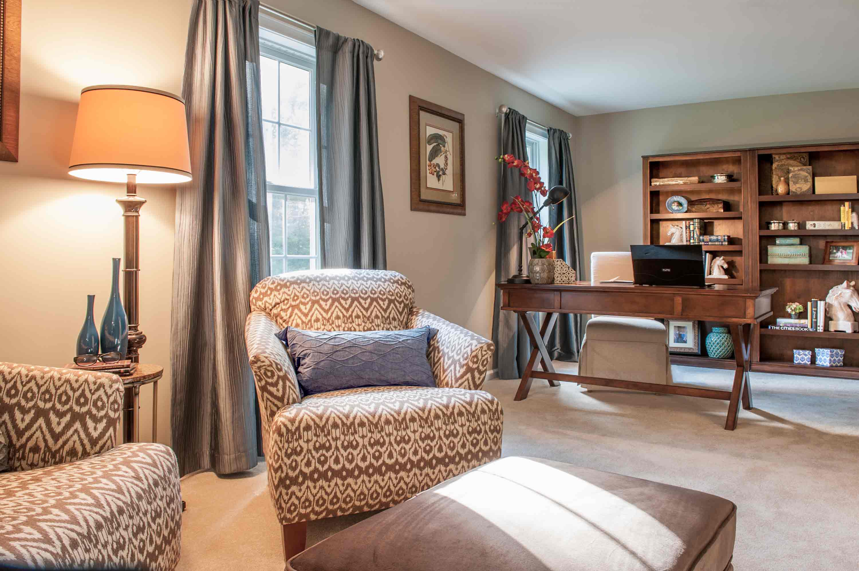
The Impact of Color in Senior Living Design
Adding a fresh coat of paint is also an easy way to freshen up any space. In fact, if a new model or refresh is not in your budget, painting an accent wall is an inexpensive way to positively change the space. You can make an effective statement by choosing the right color for your model. Below are a list of our top 5 picks for color use in senior living.
Here is a list of the top five colors used in senior living communities. How do these colors make you feel?
#1. Green
Green is a relaxing color that promotes healing. This color also conveys a sense of life and new beginnings. That’s why subtle, subdued green touches in respites could be an excellent mood enhancer for your senior residents.
#2. Blue
The emotions associated with blue are calming. This stress reducing color promotes stillness and a sense of serenity. Blue is an excellent color to convey stress reduction in senior living design.
#3. White
White does not have to be plain and sterile. In a lot of spaces, white conveys freshness and lightness. This color is also associated with goodness and new beginnings. This is another color that also signifies new beginnings.
#4. Red
Red is a great color to use in dining areas and certain common areas within your senior living communities. In fact, red is a known stimulant for appetite. Additionally, red can make you feel alert and energized.
#5. Brown
Brown is a great neutral color for a number of applications throughout your communities. This color is a calming earth tone that creates a sense of grounding.
Using Color in Senior Living Design for Safety
Using contrasting colors for wall and floor, and other surfaces is important for residents. For example, this ensures that they can differentiate between the bedroom and the bathroom entrance. Also, avoiding cool colors such as pastel tones is helpful, as the aging eye has a harder time noticing lighter colors.


*Click on the image to see this project in our portfolio
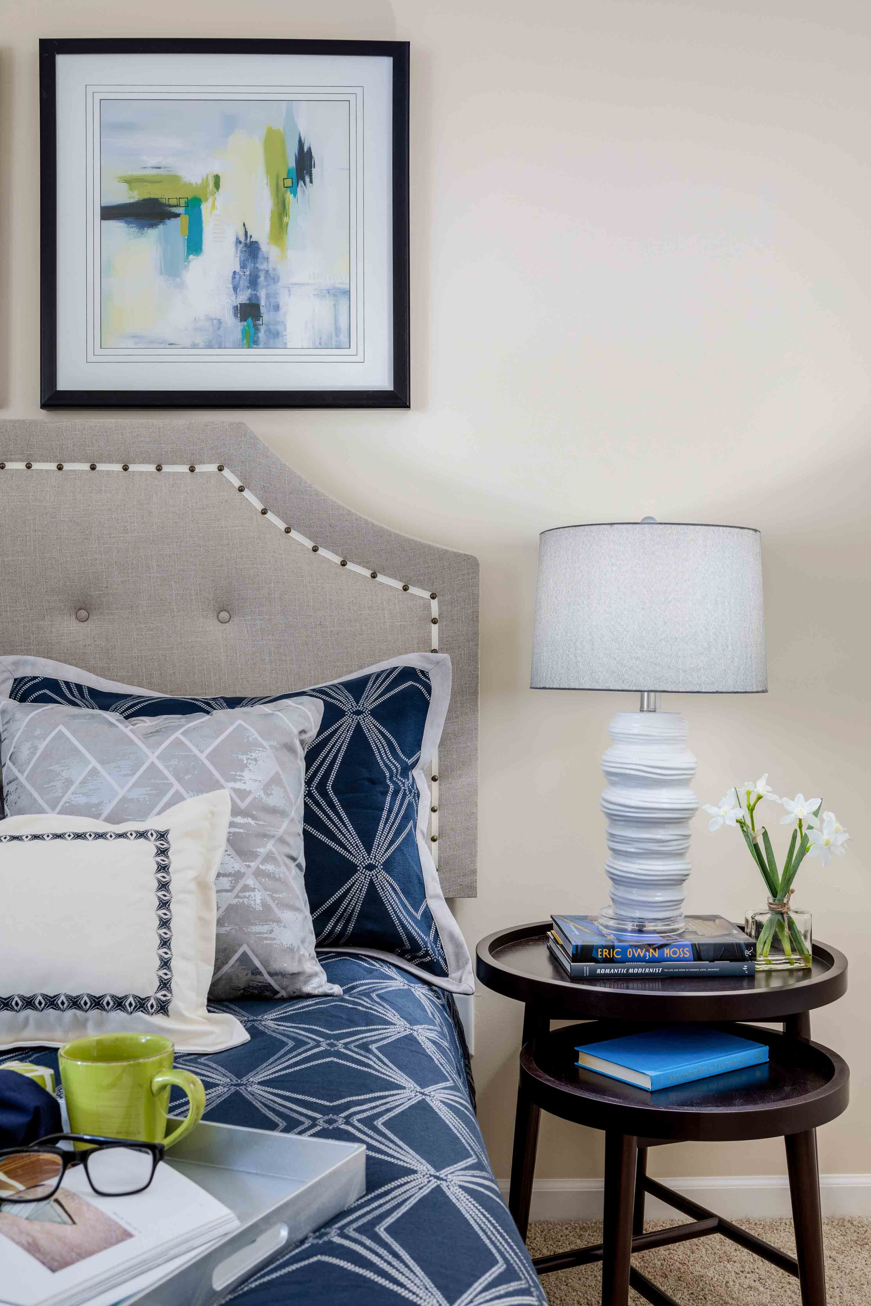
Using Color to Mirror External Environments
When choosing color pallets for senior housing, is also important to consider special elements about the locations of your communities. For example, with a coastal community, adding blues and tans will mimic the ocean and sand view residents know well.
Communities nestled living in mountains or river landscapes, will benefit from comforting earth tones such as greens and browns.
Keeping elemental colors in mind when designing model apartments is important. These color schemes can help your potential residents feel a sense of safety and familiarity in their new homes. Below are images from a model apartment we designed in a coastal community. (Two different blues on accent walls in the dining and bedrooms).

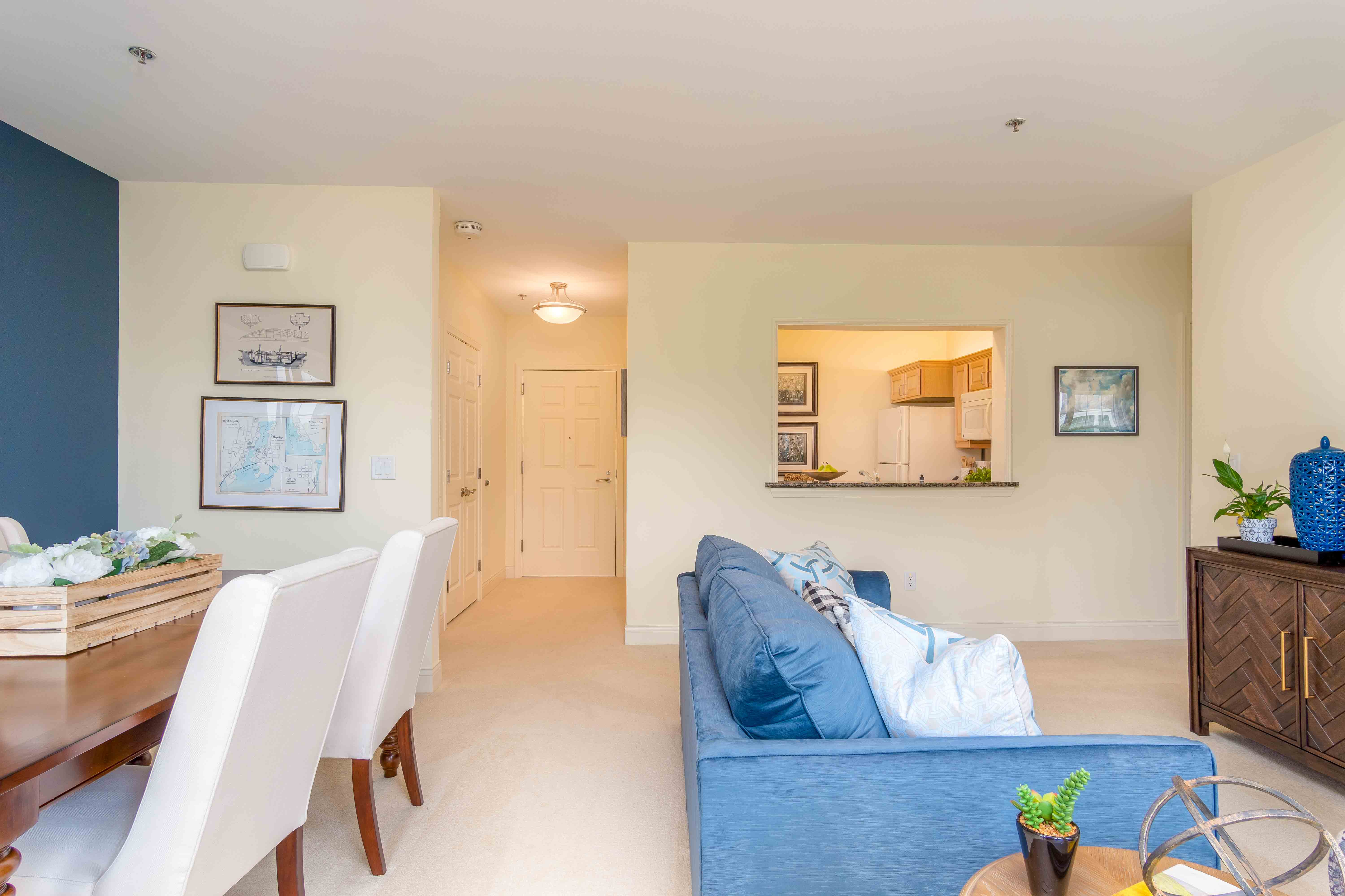
*Click on the image to see this project in our portfolio
Ending on a Happy Note
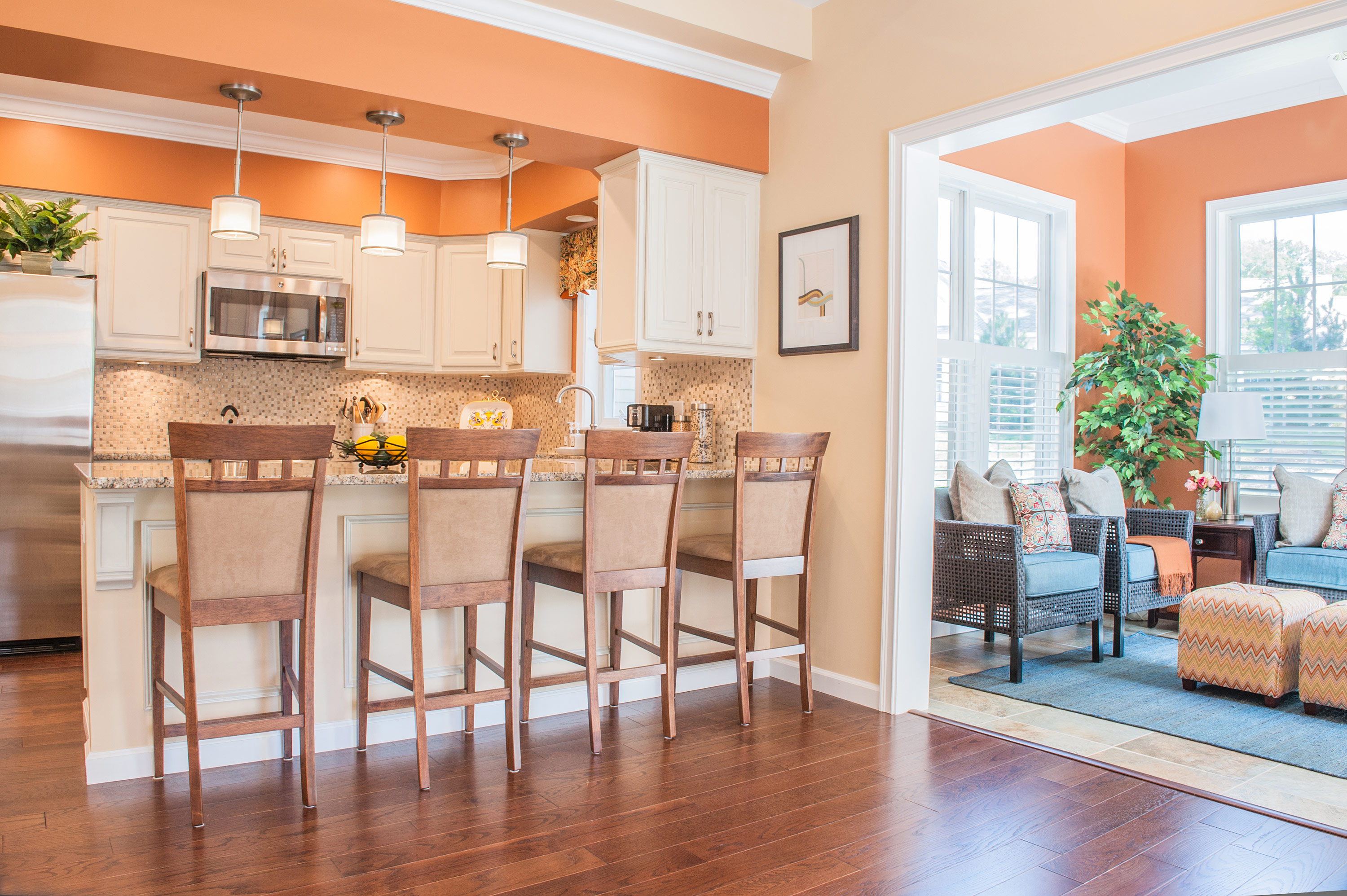
I wanted to end on a happy note, so I chose this image from a Model55 model apartment. This model was installed at a community called Highland Glen. I love how is was designed with such beautiful pops of bright colors. Using bright color in senior living design is a great way to promote happiness while eliciting uplifting energy!
*Click on the image to see this project in our portfolio
Questions about color in your senior living design?
No Comments