
28 Mar Model Apartment Design Feature: Assembly Herndon Apartments
It’s time for the latest installment of our model apartment design series!
You’ll get an inside look at Model55’s model apartment design and installation process to see how we transform our clients’ visions into beautifully designed spaces that prospective residents can’t resist.
Today, we’re featuring Assembly Herndon Apartments, located in Herndon, Virginia, a suburb of Washington, D.C. with no shortage of small-town charm. Assembly Herndon Apartments offers residents the ideal balance of roomy suburban comfort and hip urban life in their community of 1 and 2-bedroom apartments.
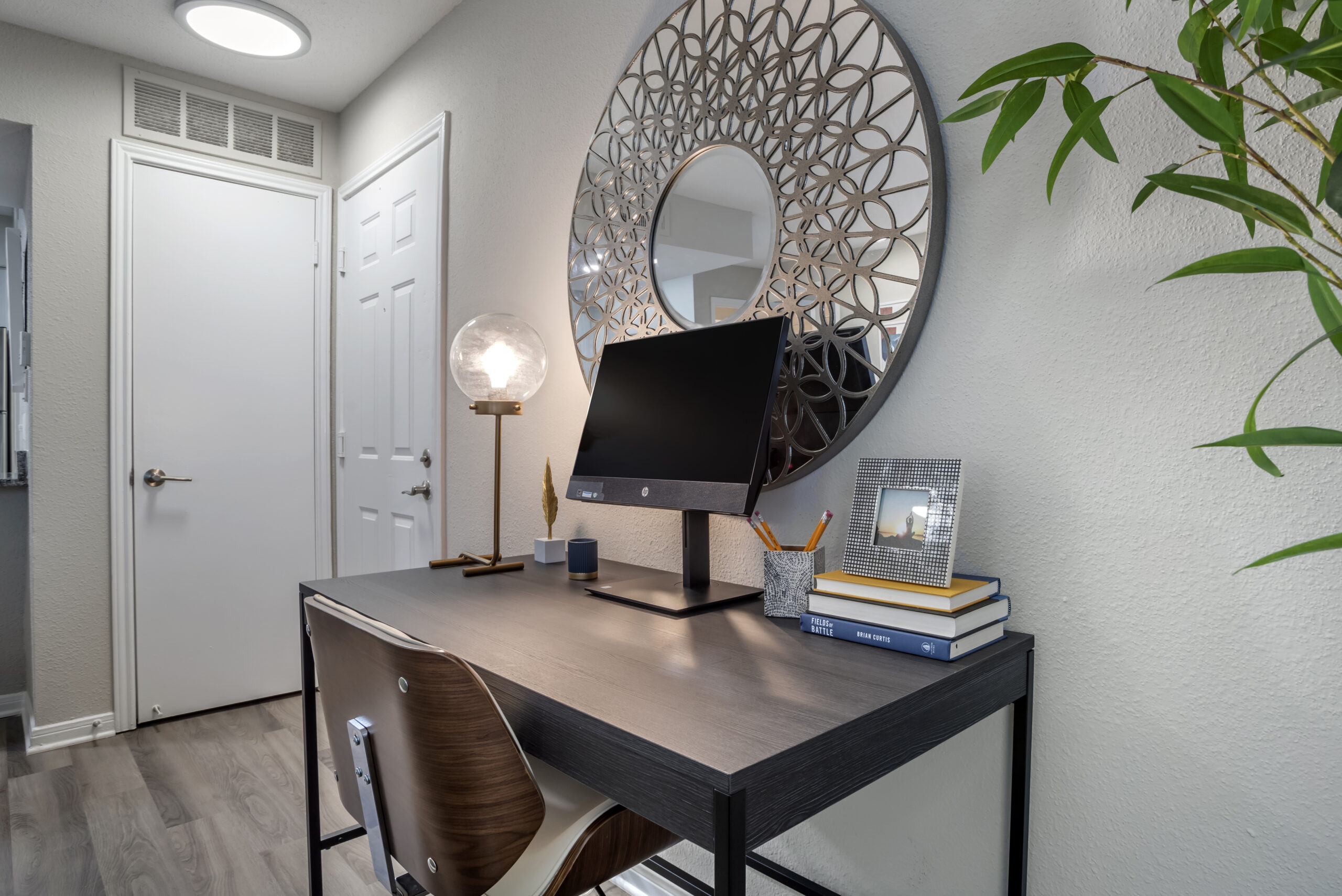
Our client wanted to emphasize quality and textures in their model apartment design. They also wanted the model to showcase its abilities as a functional work-from-home environment.
Join us for a look at this model apartment design feature!
Phase 1: Model Apartment Design
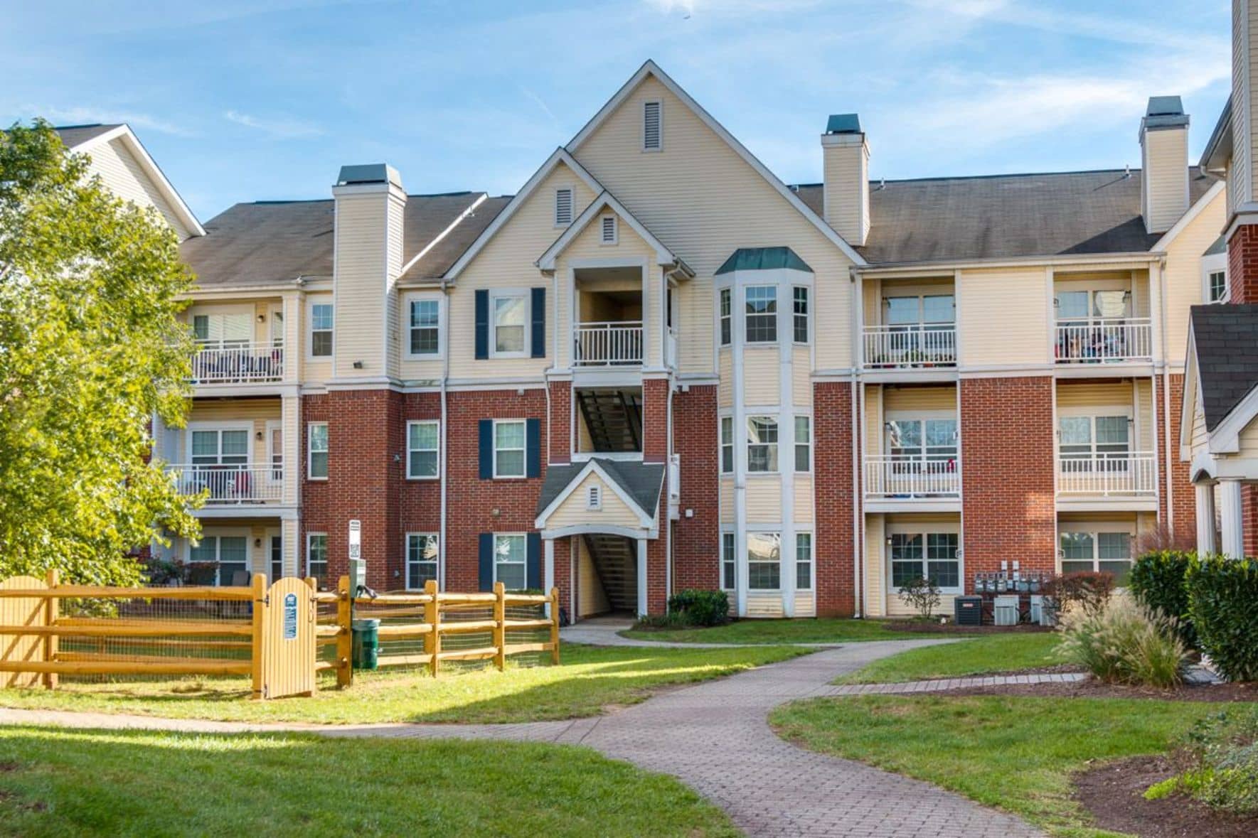
We learned from our client that their prospects are young people in transitional phases of their lives. Many residents are working professionals who are just starting their families. Some folks move to Assembly Herndon looking for a fresh start or a new job in nearby Washington, D.C.
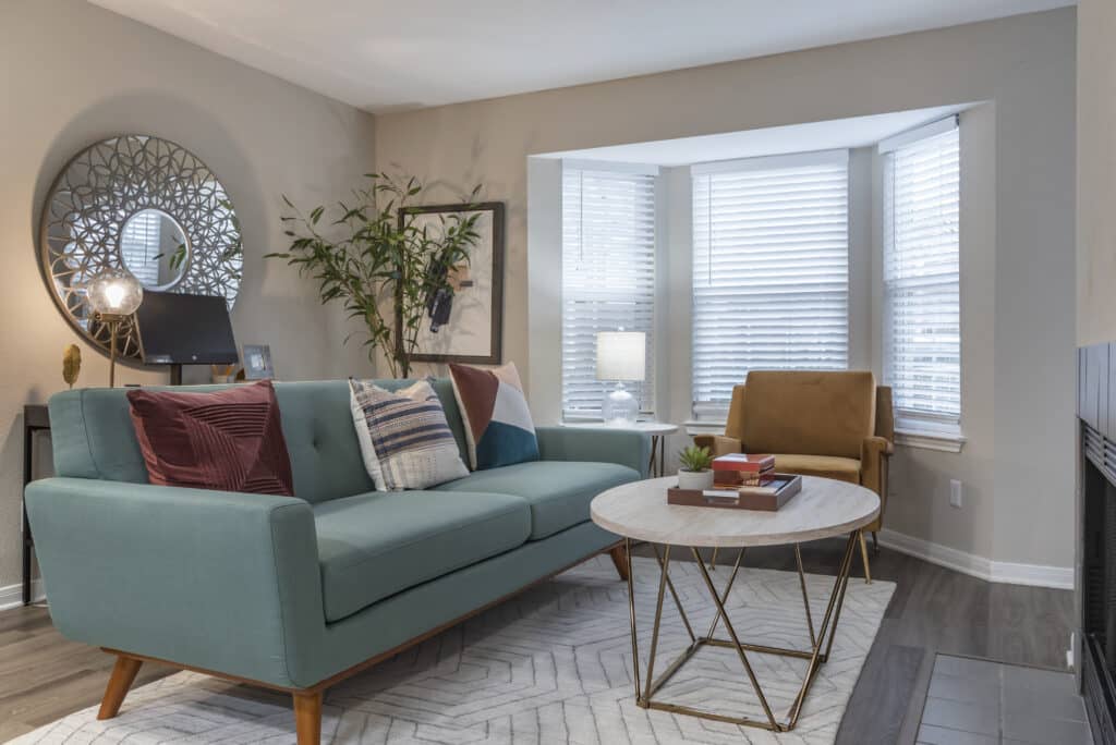
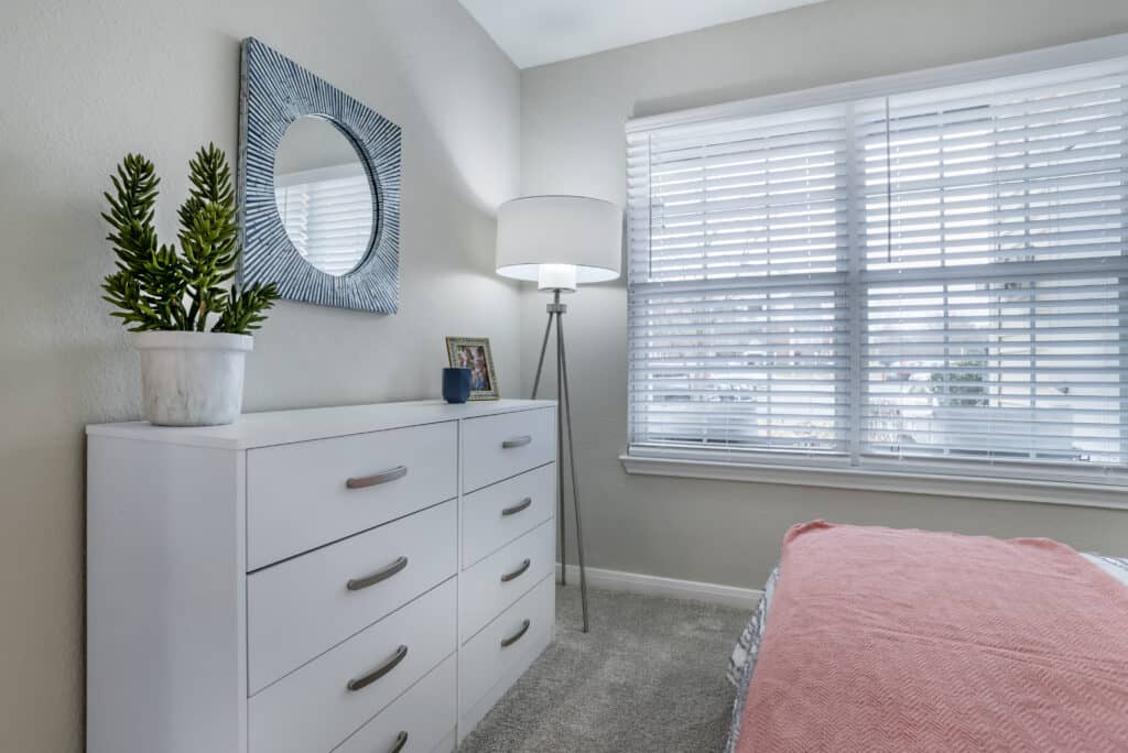
The model apartment design therefore needed to be family-friendly while also appearing hip, cool, and fun. The client requested a modern and clean design aesthetic featuring white and gray base pieces paired with pops of colorful artwork and pillows. They preferred to forgo curtains or drapes to retain as much natural light as possible.
Above all, they wanted the model apartment to look like an inviting living space and a place where residents could envision themselves comfortably working from home.
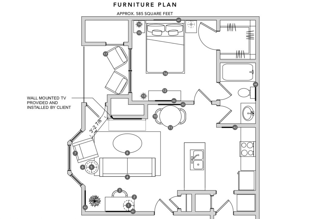
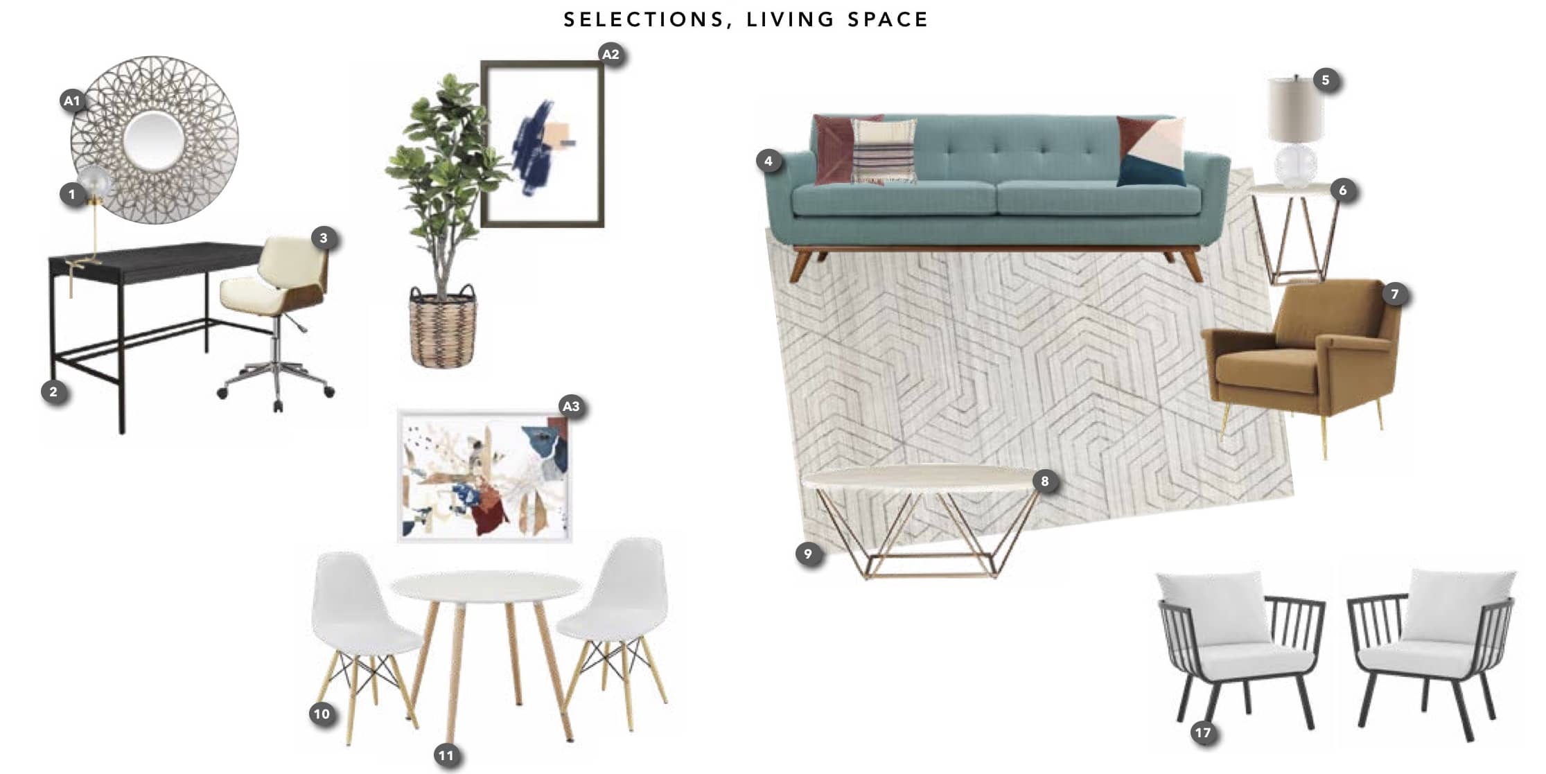
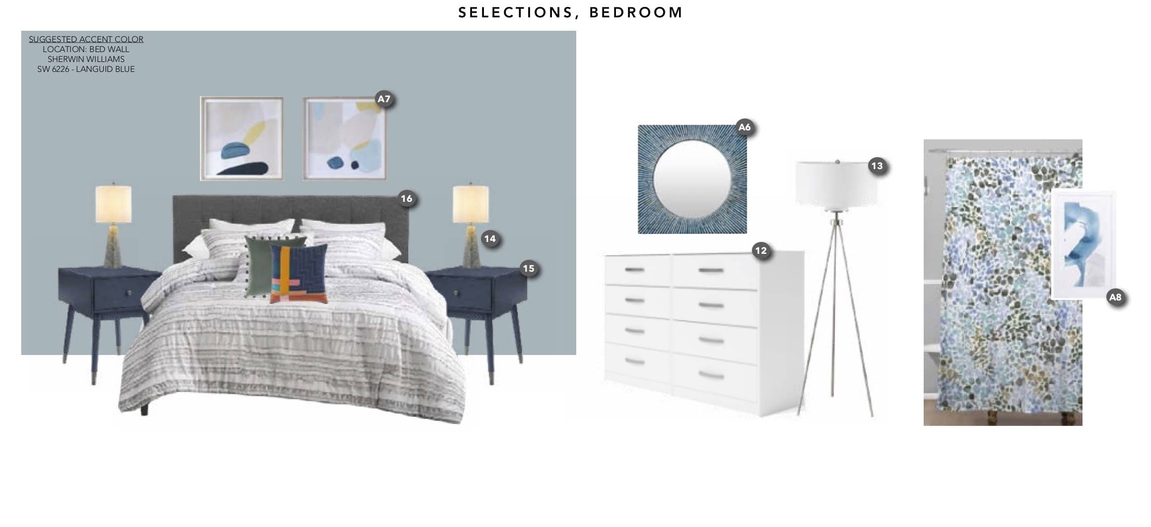
To attract young people ranging from job-searching to child-rearing, we knew our model apartment design needed to have modern and transitional aesthetics—with a slight edge. We chose neutral base pieces and spiced them up with bold accents like the sofa (#4), accent chair #7), and bedside tables (#15).
We added a statement mirror (#A1) over the desk to infuse the workspace with a bit of elegance. The lines of the mirror mimic the lines on the rug, creating a cohesive statement. The mirror is decorative but functional, bouncing light around the room to brighten it up.
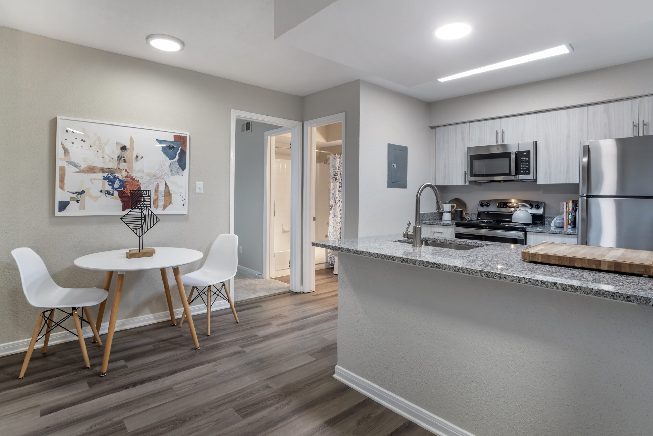
Additional elements play into the balance of modern and edgy, like the collected art piece above the dining table (#A3), which provides color balance in the living space. It’s strategically located in front of the main entrance to introduce the color story as soon as prospective residents enter the apartment.
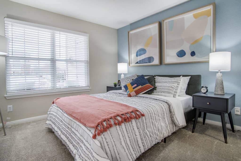
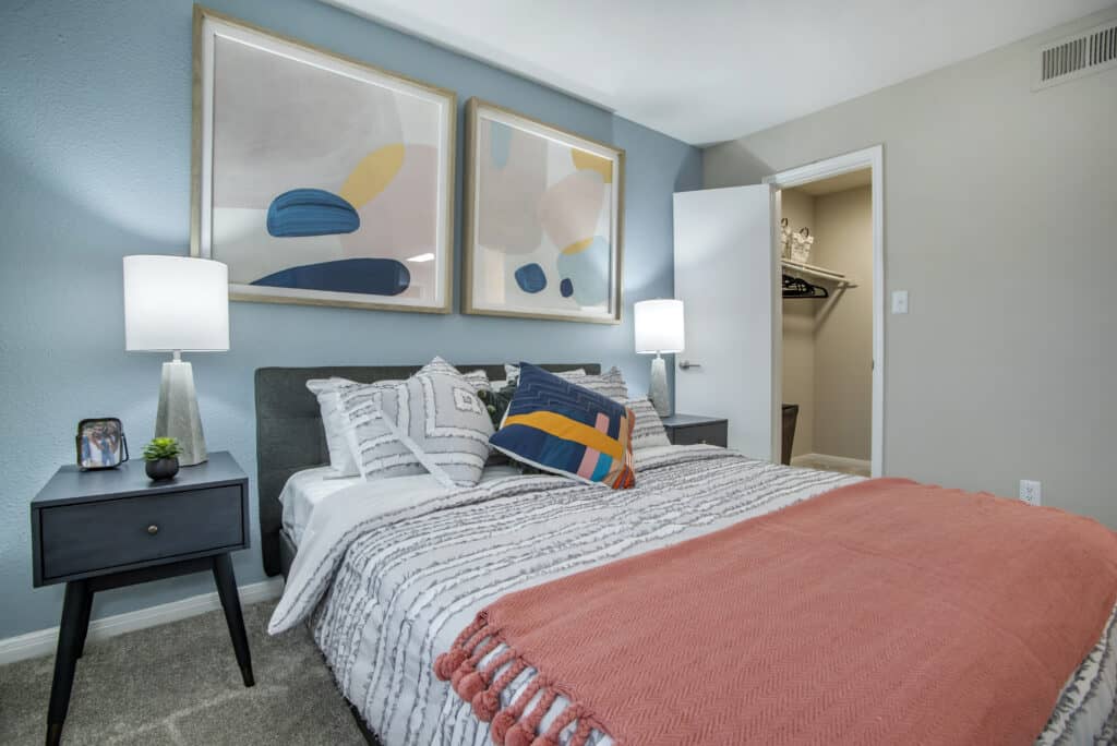
The bedroom is small, but the accent wall and oversized art above the bed make a bold statement without overpowering the room. The light blue color of the wall paired with slightly different blue accents are gender-neutral and play well off of the living space without being too “matchy-matchy” and predictable.
Phase 2: Fulfillment and Installation
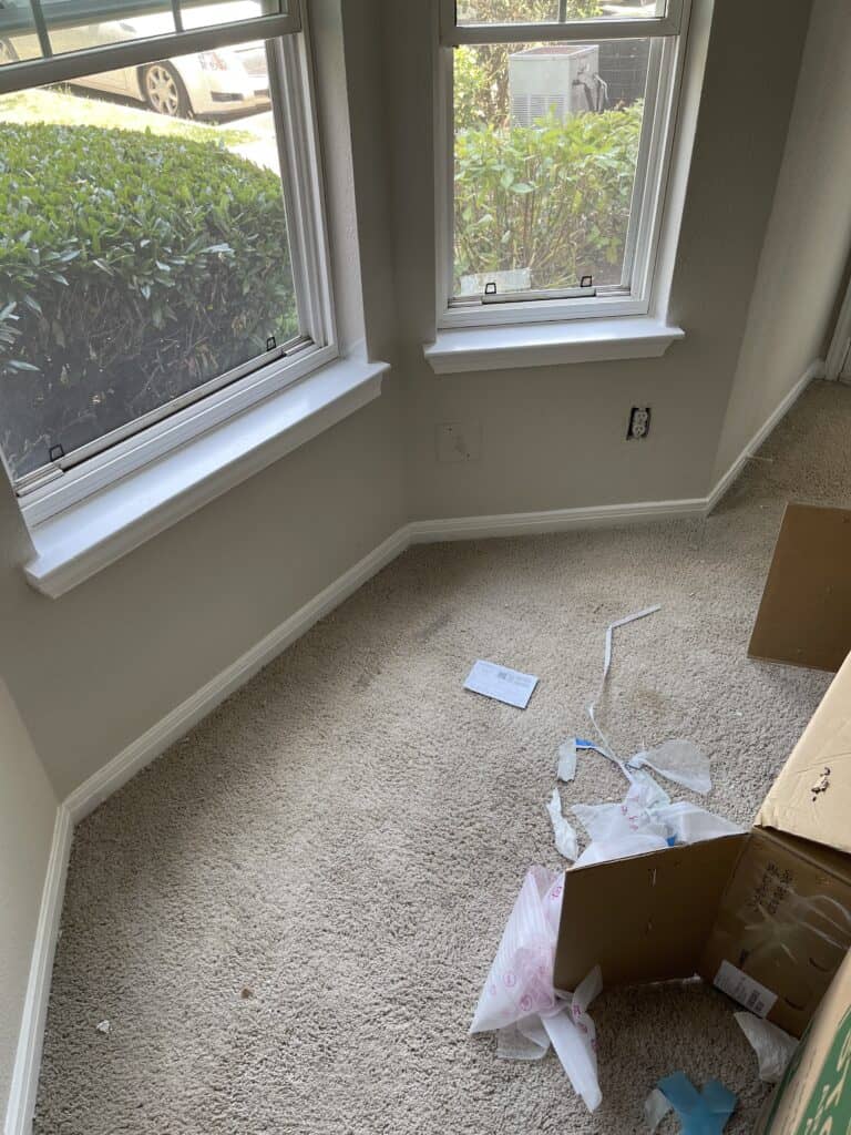
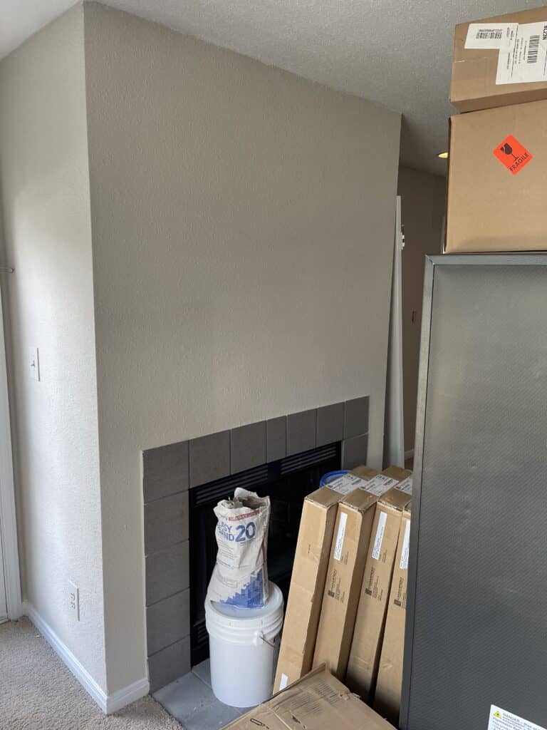
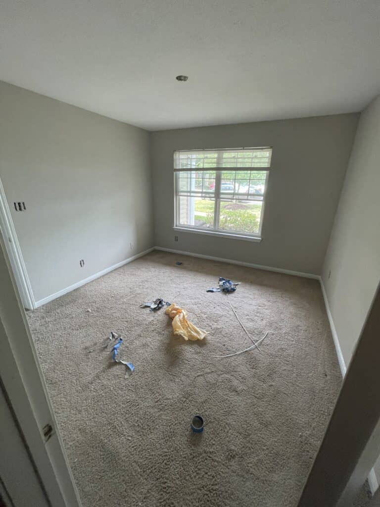
After the design was approved, our logistics team stepped in to handle delivery and installation. Our delivery team sets up the furniture and clears the space of every bit of debris before our installation team takes over.
We’re so happy with how this model turned out!
Need help designing and installing your next model? Contact us today to discuss our comprehensive model apartment staging solutions.



No Comments