30 Apr Spatial Planning 101
Interior Design is so much more than grouping pretty patterns, textures and colors together to create a beautiful space. It also takes extremely thoughtful planning on the designers’ behalf to make the end result work so well. Spatial planning was a relatively new concept to me when I started working at Model55, but I’ve learned just how important it is when it comes to design.
My goal is to help my fellow non-designers understand how to use spatial planning when designing at home. Or, you can also use these principles for a DIY model.
So, what is spatial planning? Let’s dive in.
TIME TO MEASURE.
At its most basic, spatial planning is the process of optimizing the space with the future (or current) inhabitants in mind. It also involves finding the proper scale and shape of all furniture pieces and wall décor so that the room feels balanced. An unbalanced room can feel too sparse or too cluttered. To get started, take measurements of the space that’s being designed. Your measurements should include wall lengths, window width and length, the distance between corners of the room to windows, ceiling height, fireplace (if applicable), any wall openings or door swings, and wall bump outs. It’s best to draw the plan out – to scale – on a piece of paper or with an online program. There are some free tools that you can use and some of them are very intuitive! I recommend Floorplanner.
Next, take note of any focal points within the space. A focal point is something that immediately grabs a person’s attention when entering a room and should not be blocked. This could be a fireplace or a large window. If there are no focal points that jump out at you, you can always create one when you start designing (more on this later).
IMPORTANT QUESTIONS.
Now that the technical stuff is out of the way, it’s time to ask yourself some questions. The first questions that our designers will ask themselves are: How is this space going to be used? Who is living here and how many people are living here? Will they have visitors often? What’s the demographic? What should the design style and color palette be? Before choosing furniture pieces, the flow, functionality and placement of furniture is decided first. How will people physically travel through the space? How will they use specific furniture pieces? Are you designing a large open room that needs to be separated into specific zones? Does a family live here? Or a single couple?
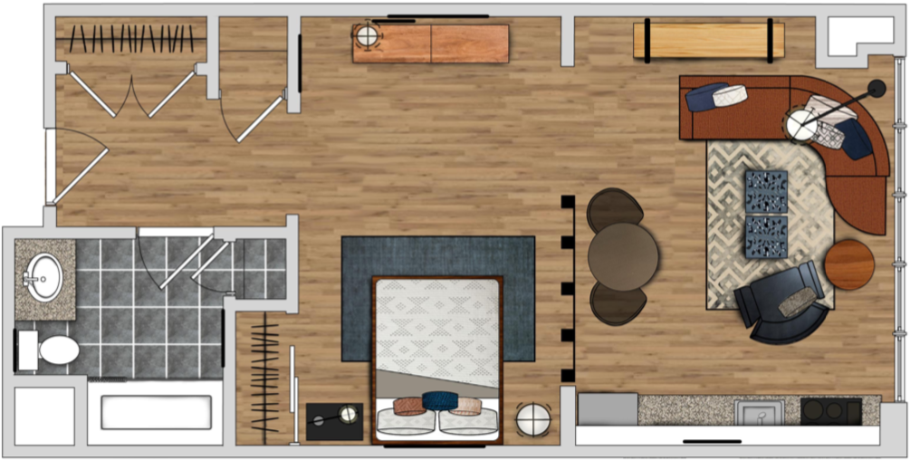
To give you a better understanding on the importance of this step, I will use one of our projects as an example and answer the questions the above. This is a studio apartment, located within a shopping hub in Medford, MA. It’s also right next to the Orange Line that leads you into Boston. The space will be used as a small yet functional sanctuary away from the hustle and bustle of the shops outside. The demographic is young professionals and graduate students who most likely commute to the city for work or education. The apartment would be home to 1-2 people, and they may not have many visitors due to the smaller size of the apartment.
The design style and colors were selected based upon words that were given by the client: natural elements, urban, fresh, bold accents, clean lines, and modern. The middle section of the floor plan is the obvious choice for the bedroom and the section on the right is where the living and dining area would be.
THIS, NOT THAT.
If you look closer at the bedroom section, you’ll notice two dressers side by side across from the bed. These were selected with a specific purpose in mind: additional storage doubling as a surface where mail and keys may be dropped when entering the apartment. A floor lamp is paired with an end table – rather than two matching end tables – in order to minimize bulk. The pieces that were selected are leggy which helps make the space feel more open.
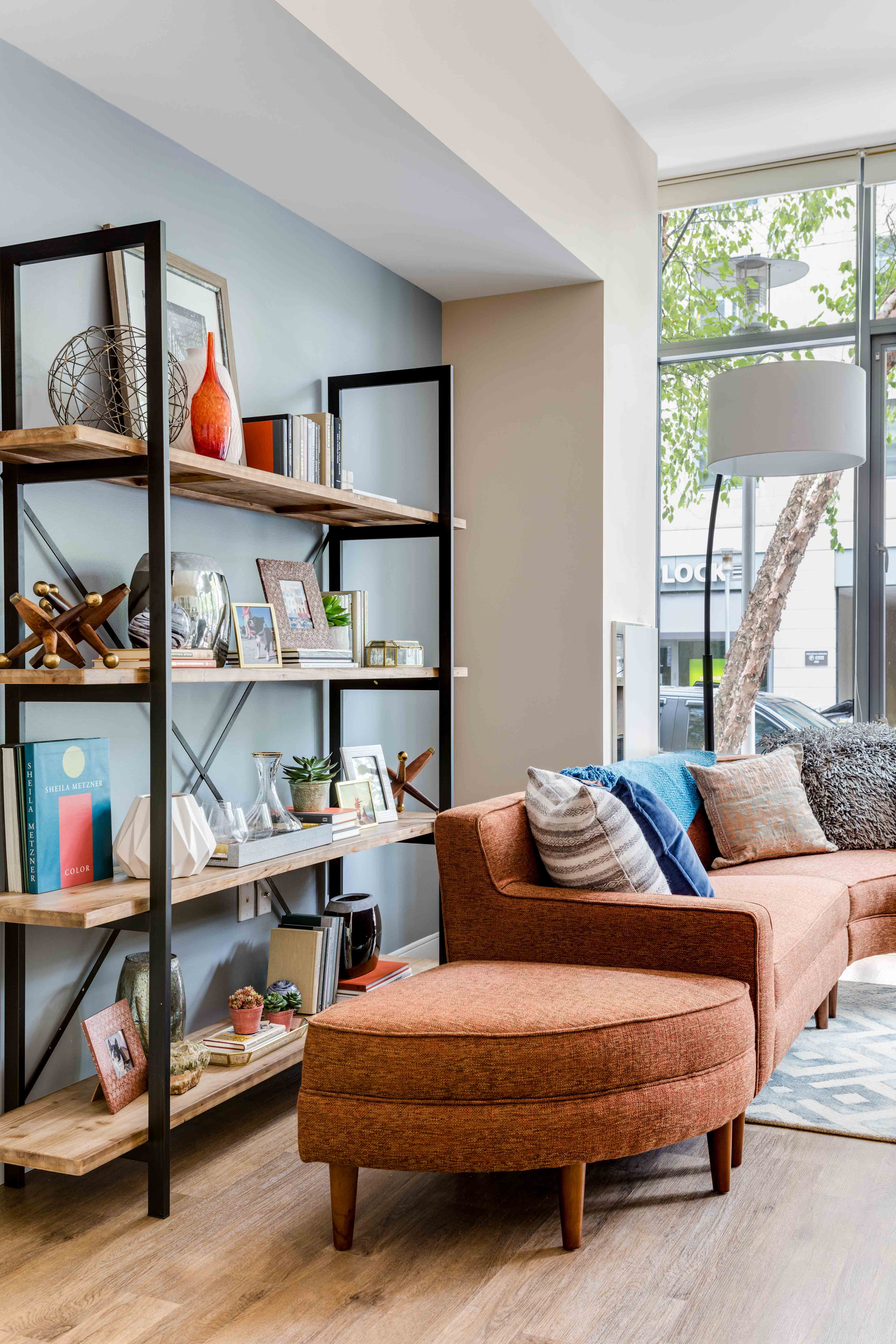
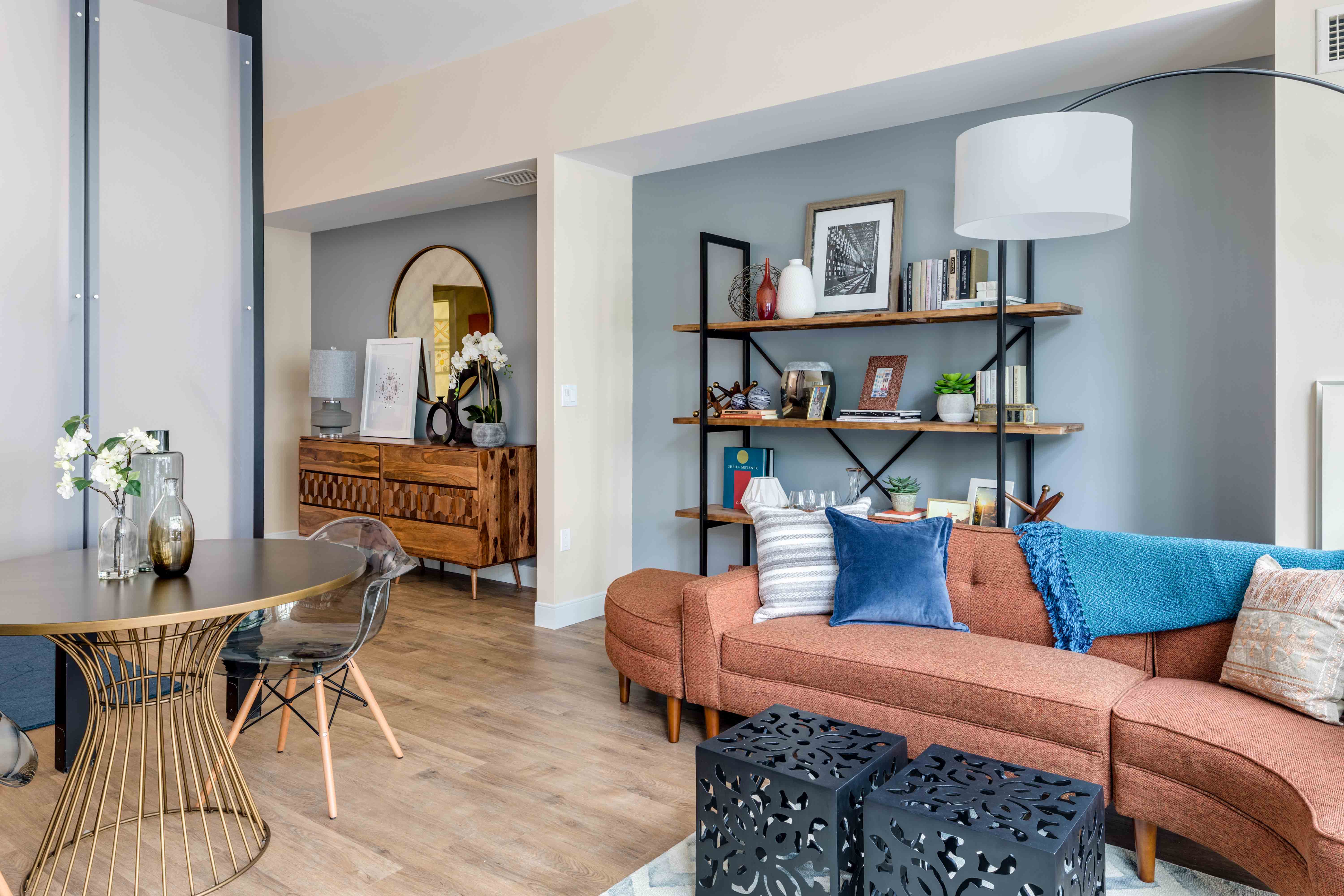
On the living area side, the couch was placed facing the kitchen in order to create the illusion of more space and to make it feel more open. The curvy, orange couch becomes a new focal point in the apartment and distracts from the busy sidewalk right outside. The two cubes are used in place of a coffee table to cut down on bulk. The small, round dining table reflects how many people live there and adds to the organic flow of the apartment. The book shelf behind the couch was chosen to frame the wall perfectly, based on its height and width. The open shelves become part of the wall, rather than a closed shelving unit that would have cluttered the space.
QUICK TIPS.
Now that you’ve read about spatial planning in practice, here are some quick tips that can be applied to any project:
- Think more about how the furniture is arranged rather than how much furniture goes into the room.
- Once your floor plan is drawn out, use generic shapes in place of furniture first in order to determine the optimal layout.
- Make sure there is ample room where people would be navigating through a space. Furniture should never create an obstacle.
- Functionality should always be top of mind when selecting furniture. What purpose does it have? Can it serve multiple?
- Finding the scale of the furniture is most important! Just because a sectional or a king bed technically fits within a space, does not mean it’s a good idea. Squeezing furniture into a room will make you feel just that – squished.
- If your room is smaller, avoid large scaled pieces of furniture and if your room is larger, try to find pieces that are taller and wider to take up more room.
- Well-proportioned pieces change the sense of scale because visually, your eyes will focus on the outer edges, which widens the room instead of shrinking it.
- Leggier pieces can make an area feel bigger and more open.
- Whenever possible, do not block windows. Windows create an extension to the outdoors, make the room feel bigger, and can provide natural lighting.
- If there’s a fireplace, your furniture should face toward it, not away from it.
- If there’s no focal point, you can create one with a large piece of wall art, a bold accent wall, or a funky furniture piece.
- Less is more! Choose fewer, more functional statement pieces rather than filling the room with clutter. For example, if you have a small living room, it’s a good idea to choose a buffet or server style piece for your TV so it can double as storage.
- Don’t hang wall décor too high above furniture or too high from the floor.
- Hang art and mirrors 66″ from their center point on the wall – which is average eye level for most people. This can vary if ceiling height is lower or much higher than average.
- Arm height of seating should be level with end tables.
- The coffee table should be level with the seat height of couch.
- A sofa table should not be taller than back of couch
- Your furniture shouldn’t be all the same height or else it will appear at the same eye level. Mixing it up makes it so your eyes can take in more than one element. Your sofa and accent chairs can have different back heights, by at least 2 – 6 inches.
- Nightstands should be level with your bedding.
- If you have a small bedroom, you can use an accent chest in place of a nightstand to create more storage.
- Play with shapes! If every piece of furniture in your dining and living space is a square or rectangular, it will be less visually dynamic than if you incorporate round shapes as well.
- Choose the right size area rug.


No Comments